Monday, 24 June 2019

ISTE Day -1


I'm here!  ISTE is my bucket filler. For the last three years, it has helped me build relationships, engage in great learning, and surround myself with positive energy.

My plan was to microblog...and well...you know the saying...the best-laid plans of mice and men.  Yesterday (what I call Day -1) was jam-packed - and I didn't pull out my laptop once.  I did post on Instagram though - so check that out.

That said, I did see some great things and connect with some great people.  Here are some highlights:


ISTE Ignites - They were all great but I particularly enjoyed Jen Casa-Todd and Henry Turner.  Jen spoke about ensuring students have voice and the importance of adult mentorship.  Henry spoke about how he turned an incident of hate into a learning opportunity to empower students.


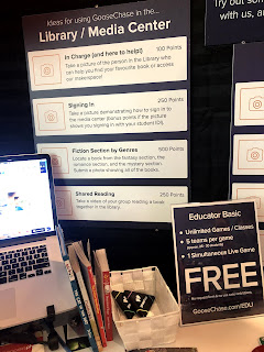
GooseChase EDU - I have heard of GooseChase but have never used it.  It is a platform that helps create education scavenger hunts.  I am part of a GooseChase now and it is a lot of fun.  I learned that they are a Canadian company!!


Lunch at the park - Self-care is important - and so Lisa Bettencourt and I headed out to Dilworth park for great food and phenomenal live entertainment.  The best part was the connection - Lisa and I got to chat away from the hustle of the conference and She told me all about a great initiative the students at Ashbury college did in partnership with the Children's Hospital of Eastern Ontario (CHEO)...more on that later.


Bought some exciting books - I love a good  book so I hit up the bookstore and picked up four!  (Which gave me 15% off and a tote bag!) . The books:


I met the Wakelet crew!  Walking around in a pack the Wakelet crew is doing some major engagement with their community.  It was great to meet them IRL.


Today I will try to blog more...but no promises, it might come out tomorrow!

Sunday, 5 May 2019

Another Day another EdTech conference! #ECOOCamp 2019

I left Connect, went home and pick up the fam and headed to Owen Sound for #ECOOCamp 2019.


The boys are at the pool and at the Owen Sound library's Mini ComiCon this morning while I am learning with friends from the BWDSB and beyond.

The day began with Peter Skillen who spoke directly to my heart.  From pedagogy, to tools, to learning, to bias, Peter's experience runs as deep as his passion, and his down to earth delivery was perfect.

I also attended a session by Leslie Boerkamp (@lboerkamp) and Nicole Batte (@nicbatte) and it was all about my favourite things - extensions. They introduced me to a couple of new ones including:

Convert Google Docs to Gmail drafts - you can write and format an email in Google Docs and, with a click of a button, you can convert the Doc into a GMail email!  (It is all explained in the company's blog post)

Momentum - Replace new tab page with a personal dashboard featuring to-do, weather, and inspiration.

All the extensions they shared can be found in their slide deck.

Thanks to Peter McAsh who invited me to speak.  It was a great day!


Friday, 3 May 2019

Google Data Studio with Richard Swandel and Jason Rodger

Richard and Jason took us through a quick look at the Google Data Studio and here I am...


This blog post will not do the tool justice as I was too busy playing to really capture as I learned...but here is what I have to say.

Google Data Studio is a powerhouse of a tool that helps you visualize data.  It is a monster of a tool but basically, we played around with some NHL statistics to create a report that looks like this:


In many ways, it is easier than manipulating data in a Sheet - no need for functions.  But grab some data and start playing around.  You can use their slide deck for info to play with and see a little of what the tool offers.

The New NFB

The National Film Board has a bunch of new and coming soon features that were highlighted in this presentation.


Campus is a collection of 5,200 documentaries, animated films, interactive productions, and short films in English and French.  It allows you to create playlists and chapters to show parts of films. 

Playlists on Indigenous Voices are also included and, coming soon is, the Learning Lodge.  Geared toward gr. 9-12, this collection will help raise awareness around Indigenous issues and stories.

Ocean School - knowledge and tools to understand our influence on the ocean and the ocean’s influence on us.  It includes

NFB Media School is also coming soon and it will offer workshops, master classes and more.

Check out a ton of new features on the NFB blog.

Badging with GSuite with Tanya Harris (for Melanie Mulcaster)

Note:  Tanya was filling in for Melanie Mulcaster who could not attend - so reach out to Melanie with questions!

The slide deck included some great videos including:


My pal Kim Pollishuke (#ShukesAndGiff) created this badge in a few minutes for our colleague Jeff who rocked the karaoke stage a few nights ago.


Cathryn Wake, a teacher from Ottawa Catholic DSB shared how her school uses digital badging to track learning skills.

You can access the slide deck for all the resources.

Cool Things I learned from Amber Mac

Amber Mac was the Friday keynote at Connect and her focus was on AI.  She shared some fascinating information...and some very cool apps like:


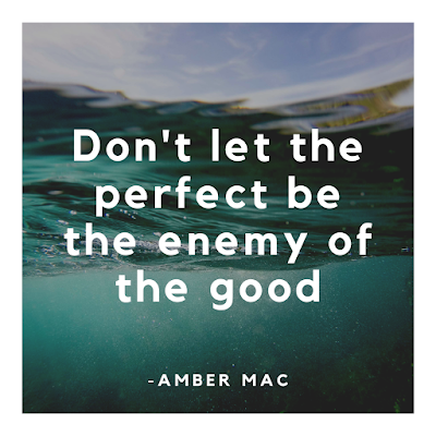
She also, near the beginning offered this advice:
And reminds us to:


Thursday, 2 May 2019

Apps with Jessi Lalonde

Jessi (@jessilalonde) took us through an A-Z look at apps we can use in Education.  It was fast paced and full of great info!  Jessi brought everything back to great pedagogical uses.  Some cool tips I took away

  • Her first slide was full of Scrabble tiles (see above) - each one was linked to the slide with the apps for that letter - VERY cute idea.
  • Save your favourite Bitmojis in Google Keep
  • Use Apple Clips to add closed captioning to videos - great for accessibility.
  • DriveTunes - a new extension to me - DriveTunes allows you to play .mp3 and .m4a audio files right from Google Drive.
  • She talked about ways to help student with executive functioning disorders keep organized with Google Keep - totally going home to do this with my son!
  • 57 North - a choose your own adventure app for your MergeCube.
  • Make challenges for students to become Chrome Kings - experts in areas of Chrome (or any app for that matter!)
See Jessi's slide deck at: bit.ly/appsohmy

Inspiring Mini Makers with Robin Holtie

I am always looking for ways to include making in the classroom.  I think the learning is so rich when learners (young and old) get dirty (metaphorically and sometimes literally).


I really enjoyed listening to Robin Holtie (@MrHoltie).  He offered some really fresh and fun ideas on making (mostly in intermediate).  From using Micro:Bits to create a Harry Potter style Sorting Hat to a Self - Contained Mars Space Station to support the reading of Weir's The Martian to Makedos in math, he offered some great ideas I had not heard before.

He also introduced me to Destination Imagination - program "that teaches "21st century" skills and STEM principles to kindergarten through university level students through collaborative problem-solving challenges."  It is a 9-month program, it is $105 to register and about $7 per student for the competition (going to finals means going to the US so prices increase there).  Totally something to check out for class or as an after school club.

You can find inspiration in Robin's Slide Deck.

Also, I sat beside my friend Laura Collins who is such an inspiration to me when it comes to coding and making (esp with littles) who told me about Klever Kutters to use when cutting cardboard.

Wednesday, 1 May 2019

ARVR with Mistene Clapp

A few weeks ago I called out on Twitter asking people about AR/VR apps in the classroom.  I got some great recommendations. (I am still working on my listicle - promise!)


Coming to connect I really wanted to learn more in person.  Mistene Clapp gave a great presentation showcasing many apps for AR/VR in the classroom.  A few to check out include:

  • Quiver - colouring that comes to life
  • 3D Bear - AR app worth checking out
  • Curiscope Virtual-Tee - a t-shirt that lets you learn about the human body on a human body.
  • MergeCube - Dozens of kid-safe apps for AR gaming, learning and creativity 
  • Object viewer - use the Merge Cube to show 3D printed before you print!
  • Jigspace - Jig Workshop is the tool to create and share interactive, 3D knowledge for anything. 
Want more?  Check out: Mistene's slide deck

CanConnected - Mad Learn - BYOApp

Session #1 is with Ms Kimberly - a rep from @madlearn (https://mad-learn.com/).

According to its website, "MAD-learn's relevant and engaging Mobile App Development program allows every K-12 student to create an app from beginning to end by empowering 21st Century technology literacy. Using the design thinking process, MAD-learn prepares today’s students for tomorrow’s careers by exposing them to all aspects of product development: ideation, planning, design, creation, testing, and launch. These vital and transferable skills are critical to today’s global technological economy."

Basically, it is a flash app.  The interface is quite user-friendly. You see a preview of the app in the middle, and the input works much like a word processor.  Overall it is quite robust.


They also have curriculum resources - although it was unclear if they were aligned with the Ontario curriculum or only Common Core standards.

Despite all this, I am not sure it is something I would use long term. The price point is high - $5000USD per building (no mention of the maximum number of students), $1750USD for a class for 30 students and $1300USD for an after-school group (no mention of the number of students).

You can get a 15-day free trial if you want to try it for yourself...and you can check out the app in the Google Play Store or the iTunes Store.

CanConnectED - My ISTE prep

About a month ago I was accepted as an emerging Edublogger for ISTE 2019!  This means that I will have a media pass and access to the conference with a chance to document what I am learning.


I have found ISTE to be overwhelming (understatement) and pulled in so many directions.  My plan is to do learning in the expo hall and in the playgrounds and document while I go.  The blogs will be microblogs - short little tidbits of sharing..longer than Tweets, shorter than I normally write.

Over the next few days, I am at the Connect 2019 conference so I am going to practice here...be prepared for a bunch of blogs! So....


Tuesday, 12 March 2019

Twitter - To Reply or Reply All?

A few weeks ago I shared my discovery of the "Add another Tweet" button on Twitter.  Today I have another cool share...the "Select Who Gets Your Reply" option. 

You know those times when someone hits reply all instead of reply?  I find that happens on Twitter all the time.  Sometimes I just want to send a GIF or short reply to the person who posted the tweet, not the other 15 people tagged in it.  This is possible...here is how:

When you click the reply icon, you see this screen:


Instead of just typing your reply, you can click the names to get a list of all those tagged in the tweet.  Then, you can check the box beside "Others in this conversation" to remove all others from the list of who will receive the reply.  You can also uncheck names individually to only include some of the others.


Saturday, 2 March 2019

Editing the Master Slide

One of my practices, when I am delivering a workshop, is to be sure I have the link to slide deck on every slide, that way if someone comes in late they can catch up quickly without feeling they need to disrupt the flow of the presentation or any other participants.  It works well for presentation in classes as well.

I used to paste the URL on each slide, but inevitably I miss a slide, or have to move it around based on content on the slide already.

Then, I discovered the Master Slide.  By changing the master slide I can add the URL (usually a custom one made with bitly) when I make my first slide, then I know it will be there, and can place text and objects on my slides around it.

To access the Master Slide in Google Slides, go to Slide --> Edit Master.  Then I add features and make changes as necessary.

Changing the master slides in a deck has many uses...change all headers to the same font/size, change features on only one slide layout, and more.

Wednesday, 27 February 2019

Have a case of Tab-itis? Try Toby mini!

At any given time I might have a dozen or more tabs open.


About a year ago I started using a Chrome extension called Toby Mini. Toby "organizes your browser tabs into Toby so you can access key resources in one-click".  It has made my workflow so easy...honestly I could not live without it.

Once you install the extension you are able to organize web resource in one place!  I have a collection for meeting  minutes and Agendas, projects I am working on, resources for #ShukesAndGiff and more.

Let me show you what it is like:

  1. You can search all your collections easily in the search bar.
  2. Group tabs together in Collections.  You can name collections.
  3. Collections can be expanded or collapsed to save space.
  4. You can open all the tabs in a Collection with a simple click of a button
  5. Collections can be shared.  By pressing the share tab a public link is created.  This is a great way to share multiple resources with others. (See below.)

  6. Collections can be re-ordered with the arrow button.
  7. The Timbits allow users to add notes between cards with links, edit titles, remove collections and more. (You can also rename the cards and erase them easily with the pencil and x icons.)

     
  8. On the left sidebar, all currently open tabs are listed.  Drag one of these into a collection to add it to that collection.  (This will close that tab.)  You can also add a tab to a collection by pressing the Chrome extension button and selecting a Collection.

  9. Create new Collections by pressing the arrow button on the bottom right-hand corner.

My three favourite uses:
  1. Load your week.  Every Sunday I load up all the links I am going to need for meetings and such in the week ahead.  This saves me a lot of time in my day and I have less anxiety is I am running late.
  2. Load tabs for a conference/class.  By using the open all # tabs I can quickly open tabs I need for a presentation or class.  This allows time for items like videos to buffer and I can meet attendees or students instead of loading up resources.
  3. Have all project resources in one place.  Instead of searching all over my Google Drive (even my starred files can get out of control) and through my Chrome bookmarks, I make Collections to have everything in one place.


Tuesday, 19 February 2019

What you find when you pay attention - multiple Twitter posts at once

In my last post, I talked about the fact that I had never noticed the Friendmoji button on the Bitmoji keyboard before.  Well...it happened again...another instance where I was blind to a button I have likely seen but haven't noticed thousands of times.

Beside the tweet button (on the web, not mobile), there is a little plus button.


On mobile it looks like this (little plus button on the bottom right - Thanks Justine Wright for that tip!):


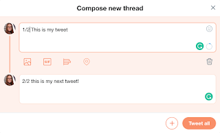
Turns out, when you tap that button, another tweet window opens underneath.  You can type in that new tweet window and, when you are ready, post all tweets at once!  


This solves the mystery (to me) of how people have really long tweets all in a row.  Full disclosure, I was often amazed that people knew how many tweets their longer message would take.  Note: I realise this might be obvious to some, and amazing to others - I fall into the later category!

So why am I sharing this?  I love how it shows that we can always discover new things in places we have been many times.  I also think it shows the importance of paying attention to the details because you never know what little treasures are hiding in plain sight!

Sunday, 17 February 2019

Changing ALL Link Colours in Google Slides

When I work in Google Slides I often include links...but the default colour for links is this weird aqua-ish green.

Weird Green colour

There are times though that I want the links to be a different colour...maybe to match a theme, or maybe to go to the traditional blue so the look of the link is familiar to others.

Usually, I would highlight the text, go to the font colour icon and manually change the font colour.  

Manually change the font

But on a slide like this....


...that's a lot of work.

So after poking around on the internet a bit, I found a way to change ALL the links in a slide deck to a selected colour.  All you need to do is enter a script on the back end of the deck once and they all change!  And the script is written!!  Thanks to Manuel at karriere.at for the script. (Follow the link in Manuel's name if you want to read his explanation of what each part of the script does to make it work.)

Here is what you do.... DON'T be scared...it looks like a lot but I promise it is easy peasy!
  1. In the slide deck click Tools --> Script Editor
  2. Script Editor will open in a new window.  Erase all data in the script (get rid of function myFunction() {  })
  3. Copy and paste this script in the window.  
  4. Click the save icon (the floppy disk) 
  5. You will be prompted to name the script project.  This name doesn't really matter.  I called mine Font Colour.
  6. Click the run icon (it is a triangle that looks like a play button).
  7. You will be prompted to authorize the script.  Click Review Permissions.
  8. Select your Google Account.
  9. On the "This app isn't verified" page, click Advanced NOT BACK TO SAFETY (this will stop the script from running).
  10. Scroll down and click Go To (Script Name) (unsafe)
    Note: the only reason it is unsafe is that you entered the script and you are not a verified app developer.
  11. Click the blue ALLOW button.
  12. Click the run icon (it is a triangle that looks like a play button).
  13. You should see a small message at the top of the window when the script runs.  Once it disappears, go back to the tab with the slide deck and all your links should be changed to blue!
  14. You can close the tab with the script editor.
How it looks after you run the script!  Two clicks!!

A few things to note:
  1. Steps 7-12 will only happen when you run the script the first time on a slide deck.  
  2. If you add links AFTER you run the script, you will need to run the script again to change the newly entered links.  You will only need to do steps 1 & 6 above (open the script editor and press run).
  3. If you don't want your links to be blue, you can change that in the fourth last line of the script.  Change #0000EE (the HEX code for Blue) to any other HEX colour code.  Remember to include the #.

Tuesday, 12 February 2019

The 4Cs and Friendmojis


Last month I went out for a bite to eat with a former student of mine, Diana.  I love catching up with former students to see how they are growing up to become incredible young adults.  I love it, even more, when they teach me something new.  She texted me this...

...and I was like...how did you get my Bitmoji and put it together with yours?!  Turns out it is called a Friendmoji (insert old person #GenerationGap joke).  She explained that if you have the Bitmoji keyboard on your phone, you can add these by clicking the little double face on the right side of the Bitmoji search bar.  Very fun!

Cut to today.  Sylvia Duckworth has a great, creative workshop all about making comics with Bimojis.  It is really fun.  She was looking to level it up. We are part of a Google Hangout Group called Maple Syrup EDU...a group full of amazing, talented, helpful Canadian educators.  We communicate in this group often - and Syl turned to the group to collaborate and generate ideas. 
So we did some critical thinking and here was how it went:
  • I shared Friendmojis..and it seemed like a solution until we realised that you need to be Snapchat friends with the other person...and we don't all have Snapchat - and a lot of schools have it blocked.
  • Chris Webb shared a doc (see shot on the right) that a student had created wherein she had created a whole bunch of different emojis to create a story...but that took making a whole bunch of email accounts and Bitmojis.
  • Jonathan So suggested using your own account and just changing it up, but that seemed a little labour intensive.
  • We all wondered if it could work with the Bitmoji Chrome extension.  It couldn't.
  • Then, Michelle Armstrong did some digging and found a Friendmoji creator!  It creates Friendmojis with just the link of two bitmoji - links that can be retrieved from the Bitmoji Chrome Extension!  #WIN!
Huge High 5 to Michelle Armstrong!

Michelle then leveled it up and created this Google Sheet to make the process easy.
  1. From your Bitmoji Chrome Extension, copy the image URL for any Bitmoji
  2. Paste that in the Friend 1 column (Column C)
  3. Ask a friend for the image URL for their Bitmoji. Paste that into the Friend 2 column (Column D)
  4. Watch the magic happen with some clever functions (like =MID). Column A will have the link you need to get this:
Me and my Friendmoji Darren Maltais

So now, we have a fun way to create...thanks to some good old fashion comminication, criticial thinking and collaboration!  Oh Canada! 


Custom Headers in Google Classroom

About a month ago, Google announced a new material theme design for Google Classroom.  One of those updates included 78 new themes.


Now I love choice...but what I might like more is creating...and one thing I love to do in Google Classroom is to create custom headers for my classes!

In order to create your own header, you need a canvas that is 1600x400 pixels.  I tend to create mine in Google Drawings or Google Slides.  I even have a template you can use to make your own headers!


Instructions for use are embedded in the grey space, but a few things to note:
  1. When the link opens, click the blue Use Template button in the top right corner to make your own copy in your Drive.
  2. Make sure you zoom out (go to the magnifying glass on the toolbar) so you can see all the grey space.
  3. I have suggested some icons to use...you can find more easily by finding or creating transparent images (see my blog post on making your own or on finding ones that are made already)
  4. Remember to be digitally responsible!  Use pictures that are licensed for your use (check out this Pinterest board full of resources to find photos).
If you are looking to create other social media posts, check out this Social Media Image Sizes Cheat Sheet.  (Thanks to the @BISDWiredTeam for making me aware of this!)


Happy Creating!


Friday, 8 February 2019

Meeting student needs

So today's post is not EdTech related but, in my opinion, an important message.

A few months ago I wrote a blog called "Google Read and Write for the win!"  It was about the positive impact that Google Read and Write had on my son.  In short, when I showed him how to use the tool, our homework battles ended.

After observing his abilities with content at home and comparing that to the assessment scores he brought home I noticed something did not match.  We decided to do a private psyc. assessment.

It was immediately obvious that my son has ADHD.  It was also obvious that he is quite bright - and that I was right - the scores don't match his actual abilities.

We got everything in place to get him an IEP to ensure his learning needs are met to ensure he can truly show what he knows at school.

Yesterday, he came home and said he feared he was one of the "least smart" (not dumb - so that was a win) kids in his class...maybe he was "at the bottom of the list".  Now, there was no list, but it was how he felt.  It was heartbreaking as a mother to hear him so down on himself.

Last week we received the psyc report and we planned to take him in to see the psychologist (or brain doctor as my son calls her) this week to have her explain it all to him.  In light of his comments, I decided that maybe we needed to broach the subject before our appointment.

I explained that the tests showed that his intelligence and learning scores put him at, above or well above the average of his peers.  Attention was the area in which he struggled.  I explained that his brain worked differently, but that didn't make him "less smart".

The more I shared how we were going to advocate for changes at school to help him learn, the wider the smile grew on his face.  When I got to the end of my spiel, I asked what he thought about it all.  He threw his arms around me and started to cry.  When I asked what the emotion was about he simply said, "Thank you".


Being a teacher, I was able to see the signs that my son was struggling that might have been missed in our system.  I feel for the kids who do not have an adult in their life to have that realization.

When kids feel valued and understood, their confidence soars.  When kids realise that the way they learn is not wrong, it is just different, their self worth stays intact.  Helping kids realise that traditional schooling methods don't work for everyone can give them encouragement, and fosters confidence, and excitement.

I know this is not earth-shattering for most of us....but it can be for a young learner.  Do you have a student that could use this kind of understanding?  Why not have the chat with them?  They might just hug and thank you too.


Tuesday, 5 February 2019

Making transparent images

Transparent images are great to use for slide decks, green screen activities, and more.

Do you need an image with a transparent background?  There are a few ways to do it that don't require you to know how to use Photoshop.

You can find images that already exist...

Google Images

  1. Go to Google and search 
  2. Click Tools (under the search bar on the right)
  3. Under the colour drop down, click Transparent.


You can also use a picture you already have (even one you have downloaded from the web) and use a web tool....


Photopea 

  1. Visit Photopea
  2. Click "open from computer"
  3. Use the eraser tool
  4. Save the photo
Example: 


Lunapic 
Note: This one works best when the background is a single colour.


  1. Visit Lunapic 
  2. Click "Upload" and upload a file
  3. Select "Edit" --> "Transparent Background"
  4. You can change the transparency on the slider to remove more or less
Example:


PhotoScissors
  1. Visit PhotoScisssors online
  2. Close the pop-up window asking you to download the app
  3. Click the "Upload Image" button
  4. Draw green lines over what you want to keep
  5. Draw red lines over what you want to remove
Example:


Remove BG
Note: This one only works on pictures of people!  

  1. Go to Remove.bg
  2. Click "Select a photo"...that's it!!
Example: